Saturday, April 19, 2008

Ding!

So I've been fairly delinquent on the blog front lately, but I have a good excuse - I've worked over 60 hours this week on the International, and when I'm done each day its usually difficult to focus on anything art related. Couple that with the fact that the Pittsburgh Penguins are tearing through the Stanley Cup playoffs, which also provides ample distraction, and its easy to understand why.

However, I had a decent group of people stop by on Friday (by which I mean an exemplary group of people, of decent size...not the people, the group) and in addition to eating some delicious BBQ-ed victuals cooked by the one and only Dani Simmons, they checked out a few of the paintings I've been working on recently, and were caught off guard by how small they are. Thats right, 5x7 actually means 5 inches by 7 inches. Its not that I don't have an aversion to working on a bigger scale, but I enjoy the intimacy of a smaller piece, and its just difficult for me to find the time to do larger pieces and not get derailed by constantly being interrupted by unimportant things, like work. Interestingly enough, after having a (short, slightly drunken, and hilarious) conversation with my guests about these pieces, what do I find when I wake up Saturday but an article in the New York Times by Roberta Smith about small paintings. Its a fairly interesting article, and I definitely found some commonality in a few of the reasons she suggests, particularly the bit about small works sharing an affinity with the printed page, among other things. However, the article also annoyed me at the same time with lots of generalizing about "art today," particularly her complaint about the "mind-boggling degree of spectacle that afflicts so much art today." I've now been working on the Carnegie International in some capacity for over four months, and for the past two months I've been involved in a very hands on way: installing the show. The International is very much a view of art today, and the spectacle that she complains about, from what I've seen, isn't so much about the art as about all the bullshit around the art, especially the various art fairs. Enough of that for now.

Anyways, no mind-boggling spectacle here, this is another small work, 5x7, that I did several days ago and am only now managing to upload on here.

I am planning to start working on some larger things soon, although they'll probably remain mostly in the planning phase until after the International opens May 2.

Monday, April 7, 2008

angle dangle

New thing from Saturday. 5x7. Started out much flatter than it ended up. I actually started this painting because of a pattern I saw on screen when I was watching the new Roots music video, and happened to randomly pause it. I didn't really like what I ended up with, so I started adding shapes until I did.

Every now and then I'll probably be posting music bits and pieces that I find for anyone who happens by here to check out, maybe even mixes and that sort of thing. We'll see how inspired I get. For now:
Miles Benjamin Anthony Robinson - Buriedfed (jacked from Metallungies). When I first heard this track I got kind of annoyed, it reminded me a bit of some 90s Pavement-esque lazy singing/over-dubbed off kilter vocals type "indie" shite. The more I listened to it, however, I warmed up to it. You can see the influence of TV on the Radio on this guy for sure, so its no surprise Kyp Malone is involved. The slow build-up is great.

Ok, since mentioning the Roots, I gotta link to this video that I found on youtube the other day - I think its circa 1994, of Blackthought and ?uestlove freestyling in an alley with graffiti going on in the background. Ill.

Saturday, April 5, 2008

Grid


This is maybe going to be part of a larger overall piece, like 64 squares total, although I'm torn because I kinda like it as the smaller grid. Each square is 8x8 so the total dimensions are around 40x24. Its hard to tell from this image but each of these is using the same decollage/image transfer technique I used in previous posted work. I guess now would be a good time to sort of explain what that technique consists of, since I haven't done that yet.

Essentially, for each square, I start out by painting it white with a fairly thick layer of white primer - the same kind you'd use to prime your walls before painting your house. While that paint is still wet, I find an interesting image from the newspaper, or an interesting sequence of colors if I don't particularly want the image to stick out. I then press that down on the painted square until its fairly firmly affixed. Then, depending on what I want in the image, whether I'm going for texture or a recognizable image, I leave certain parts of the newspaper on the cardboard square for longer or shorter periods of time. As I peel away the found image, the paint picks up bits of the pigment, and in some cases, bits of the paper itself. The result is a textured ghostly tableau. I first tested this out on thick paper, but found that working on corrugated cardboard gave a great effect because the primer dried faster at the tops of the ribs and thus picked up more of the image, giving it a striped texture similar to choosing lines on a bitmap when making a silkscreen. I really like this process because I get very physically involved with each image - I sometimes have to kind of fight the newspaper to give me the image I want and it definitely doesn't always work out, but something interesting usually happens. Below is my favorite image from this grid, which I'm pretty sure I'm going to want to stand on its own in the future.

[james brown is dead]


I stole that title from a Mark Bradford painting, but I think it's appropriate. I couldn't find an image of that particular painting of his, but it's in this video (taken by some guy who, from the sound of his breathing, must be holding a very heavy camera) of his show "Nobody Jones" at Sikkema and Jenkins from this February.

I'm probably going to replace the above image with a better one in the near future; its hard to photograph, and my fuckin camera ran out of batteries, so shiiiiiiiiiiit.

Wednesday, April 2, 2008

AIR-ness

Before I was working on the International I was interning at a printshop called AIR, which stands for Artist Image Resource - although its kinda cooler as just AIR, and most people here tend to know it that way. Anyways, AIR is a very rad place; very unique as far as gallery spaces go in that it is both a production shop and a great exhibition space. Lots of incredibly talented people there and great people running the show. I've been semi involved there, with the hopes of being more so in the future, although at the moment the International is keeping me too busy to get over there. The point of all this is AIR gives me a place to work in media other than painting, and since I've been "working" there for more than a year I've had a lot of time to integrate printmaking into my sort of ouvre, if you will. Will you? You will? Sweet.

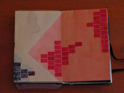
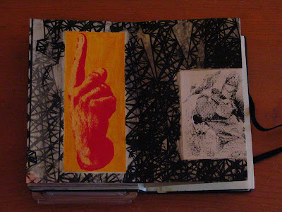
As some of you who are reading this will know, I've been working on a series of moleskine notebooks that are kind of an exercise in mixed media, all of which include collage, pen and ink, paint marker, stickers, screen prints, mono prints, decollage, image transfer, watercolor, and probably others that I will remember later. I did one of them last summer in Thurmont, MD, the ancestral homestead of the Whelan-McGill clan, while staying with my compadre
Robbie, which you can see below. Its kind of hard to tell from these photos, but the book is actually a Japanese-style accordion book. For me this was pretty interesting because I had to think about it both as small compositions (for each set of two pages) and as a larger composition (for the whole book unfolded as one image). These images below give an idea of what several pages look like together. The whole thing unfolded is around nine feet long! There are two more of these that are nearly complete, and a fourth that is in the beginning stages, so at the very least two more of these should be forthcoming soon.

I've recently begun trying to integrate printmaking into the paintings I've been doing using the image transfer/decollage technique that I showed in the past two posts. This is the only one so far, but I kinda like it.